|
|
Post by Zugarth on Jul 21, 2023 7:17:06 GMT -5
It has gone a little quite here, so I thought I would have a play with the main character card design for a bit of fun. When I have seen other designs on the internet, they have mainly been a background art change. I wanted to have a go at changing the layout as well. One of the things I wanted to do, was move the numbers. To me, the area under the numbers is wasted space (more in Current layout than Classic), and moving them would help to create a little bit of extra space to put gaming text. Instead of relying on scans/photos on the internet to compare the differences between each design (the two official and mine), I have recreated them using the same image on each kind. This is to show the design isn’t influenced by an image alone. Might as well start with Hicks: Premiere 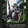 converted to Current 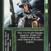 converted to Fun  Followed by Ripley: Resurrection  converted to Fun 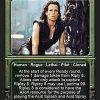
Alien Queen next, followed by Cloned Warrior. I wanted to give them an environmental feel, rather than an organic feel: Premiere  converted to Current  converted to Fun 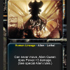 Resurrection  converted to Fun 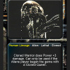
Finally, a couple of Predators. I moved Honor in with the Restrictions/Resources traits, to make it a focus rather than tagged to the start of the gaming text: Premiere 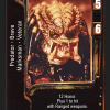 converted to Current 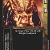 converted to Fun  Resurrection 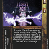 converted to Fun 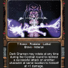 |
|
|
|
Post by sherm on Jul 23, 2023 6:49:25 GMT -5
Getting 503 error if I follow the link.
Was only thinking about this game about an hour ago... May go thru my collection ( that's sitting in the shed) and just build 2-3 decks that I will actually use for playing and not just keep in a box.
Hope everyone in here is doing well and going strong.
|
|
|
|
Post by Axlotl on Jul 23, 2023 23:28:40 GMT -5
Solid design. Merging the attribute box with the text box is definitely a more "modern" take on the design that I support. I think a redesign would benefit by having labels for the attributes, like in Terminator, or some other sort of identifier. I'm also not a huge fan of the attributes flanking the name. Maybe it's my design biases being influenced by other games I've played, like MTG, but a lower position on the card feels more "natural" to me. Like some sort of stat bar overlapping the text box, Ala MTG, or overlapping the image like some of the old Score DBZ CCG cards.
|
|
|
|
Post by Zugarth on Jul 31, 2023 7:13:41 GMT -5
This was one of the other concept designs I played around with.
This was in keeping more to the game layout. After playing with this, that is when I wanted to try something even more different.
|
|
|
|
Post by sherm on Jul 31, 2023 21:24:36 GMT -5
Oh I like that layout.
I had a couple homebrew games that could have used this template
|
|
|
|
Post by djibutini on Aug 3, 2023 7:49:43 GMT -5
Hey Zugarth,
I have all the errata and text spoilers on my google drive for the Premiere set, I could remake all the characters up pretty easily for you using nanDECK if you have a nice hi-res 'blank' copy of each of the templates...
|
|
|
|
Post by limbsofosiris on Oct 21, 2023 17:32:17 GMT -5
I made these recently. Don't know much about the game, just like designing cards. Fun to visualise how a game could look with a different approach as OP mentions. Ripley
Face hugger attack |
|
|
|
Post by Zugarth on Oct 23, 2023 4:52:04 GMT -5
I really like the appearance of the cards. Great job! As you mentioned, you don't know much about the game, and even though I like the design, there isn't enough room for gaming text. Cards like High Adjudicator and Newborn wouldn't work (text is already tight on these cards), unless the size of the gaming text box resizes based on the amount of text require? |
|
|
|
Post by limbsofosiris on Oct 26, 2023 2:53:21 GMT -5
Hi Zugarth, in fact you can certainly resize text boxes or remove entirely. If someone wanted to seriously use the design that would be a must. I've found that fading the art the way you see in the samples gives a pleasing blended effect.
Glad you enjoyed them, and thanks for your work on the game, it's been enjoyable to peruse these forums.
|
|


