|
|
Post by Axlotl on May 6, 2019 18:38:01 GMT -5
|
|
|
|
Post by whiteumbrella on May 7, 2019 12:46:31 GMT -5
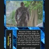
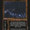
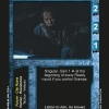
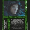
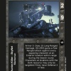
Definitely like the Skynet ad Supporting character templates, as well as the Event one. The Resistance template is a nice nod towards the original template. The interior Location one looks a bit pixelated. Can I ask the reasoning behind changing the color of the Exterior Location template (mainly because curiosity)?
|
|
|
|
Post by Axlotl on May 7, 2019 21:24:09 GMT -5
yeah, the Interior location one was an experiment in merging layers and transparency - I didn't make any of the others in the same way. It looks bad close up, but may look ok printed, or may not, if it still looks bad I'll redo it.
The Exterior Location is more brown, less beige, but still pretty similar to the original, just trying for something a little more distinctive, color wise. It may be recolored, once I have the physical test cards in hand.
Supporting Character was the last one I did, and I think it really shows.
|
|
|
|
Post by whiteumbrella on May 7, 2019 21:57:39 GMT -5
It does, definitely. Is the Item template a recolor of the AvP Resurrection Event template, or is it just very similar?
|
|
|
|
Post by Axlotl on May 7, 2019 23:16:53 GMT -5
Just similar. The actual item template has the hazard stripes, but very faint, so I grabbed a hazard stripe background off the web and recolored it.
|
|
|
|
Post by Axlotl on May 16, 2019 12:36:07 GMT -5
Got the test prints today - I think they look pretty good for the most part.
The interior location pixelation isn't too bad with cards in hand. I don't think it needs changing.
SkyNet MC needs to be lightened up, for sure.
Might try and reduced the darkness of the stripes on Items, and might lighten Exterior locations as well. Rest look pretty good, IMO, much more vibrant colors than premiere, so the cards look more distinctive.
|
|